

SHAPE BY Style
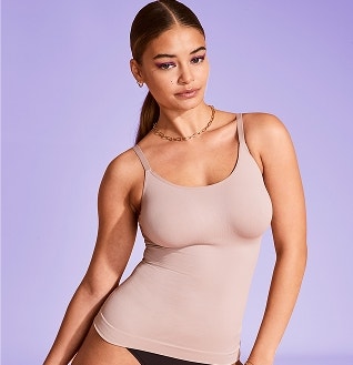
SHAPING TOPS
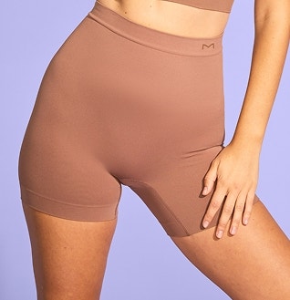
THIGH SLIMMERS
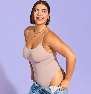
BODY SHAPERS
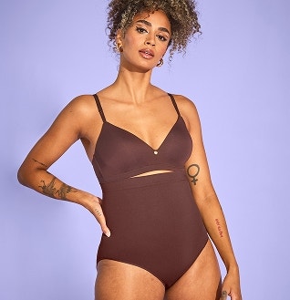
SHAPING UNDERWEAR
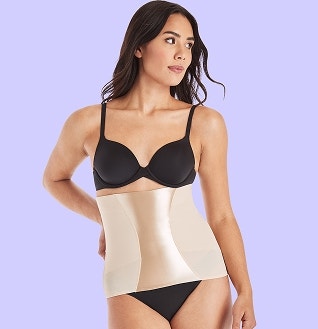
WAIST CINCHERS
LEVELS OF Control
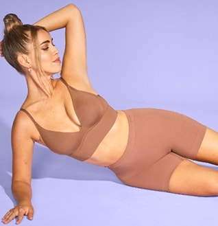
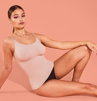
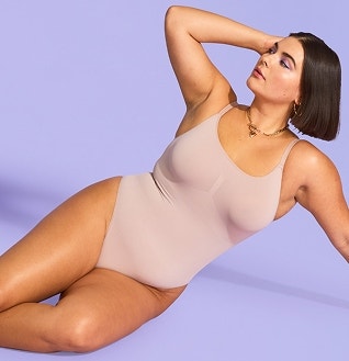
GET THE Perfect Fit
Wear
To put your shapewear on, step in feet first, then pull up.
COMFORT
Our shape is designed for comfort. If you feel any poking or digging, try a size up.
SIZING
Your true size will always give the best results, never size down.
Ready to Ooh and Aah?
.hero {
margin-block-end: var(--gutter-l);}
.hero h1 {
text-transform: uppercase;
color: var(--clr-brand-indigo);
font-size: clamp(2rem, 1.6rem + 1vw, 3rem);
}
.hero .copy-wrapper {
display: flex;
margin-inline-start: auto; flex-direction: column;
align-items: center;
}
.hero .copy-wrapper > div {
width: auto;
}
.hero .copy-wrapper > div .button {
width: min-content;
white-space: normal;
margin: 0;
padding: .5em 1em;
}
.default-content-wrapper :is(h2, h3) {
text-align: center;
color: var(--clr-brand-indigo);
line-height: 1.1;
text-transform: uppercase;
text-wrap: balance;
background: var(--clr-white);
width: fit-content;
padding-inline: var(--gutter-m);margin: 0 auto .5em;
z-index: 10;
position: relative;
}
.default-content-wrapper h2 em {
display: block;
font-family: var(--heading-font-family-secondary);
color: var(--text-color-pink);
text-transform: none;
}
.columns-scroll-wrapper {
background: var(--clr-brand-white);
padding-block: var(--gutter-xl) 0;}
.columns-scroll .copy-wrapper > p {
text-align: center;
font-size: clamp(1.4rem, 1.2rem + 1vw, 1.8rem);
text-wrap: pretty;
padding-inline: var(--gutter-xs); line-height: 1.2;
margin-block: 0.3em;}
.columns-scroll .copy-wrapper > p:first-of-type {
font-weight: var(--fw-bold);
color: var(--text-color-pink);
font-size: clamp(1.2rem, 1.5vw, 1.6rem);
text-transform: uppercase;
}
.section-fit .copy-wrapper {
background: var(--clr-white);
border-radius: 50%;
aspect-ratio: 1;
display: flex;
flex-direction: column;
justify-content: center;
margin-block-end: var(--gutter-l); z-index: 1;
position: relative;
}
.button-container {
text-align: center;
}
.section-control.columns-scroll > div a {
position: relative;
}
.section-control.columns-scroll > div a::after {
content: '1';
display: block;
background: var(--clr-brand-white);
position: absolute;
left: 0;
padding: .08em .3em;
top: 0;
font-size: 150%;
font-weight: var(--fw-bold);
}
.section-control.columns-scroll > div:nth-child(2) a::after {
content: '2';
}
.section-control.columns-scroll > div:nth-child(3) a::after {
content: '3';
}
@media (width >= 375px) {
.hero h1 {
font-size: clamp(2rem, 2rem + 1vw, 3rem);
}
}
@media (width >= 600px) {
.hero h1 {
font-size: clamp(3rem, 3rem + 2vw, 6rem);
}
.hero .copy-wrapper > div .button {
padding: var(--button-padding);
width: max-content;
white-space: nowrap;
}
:is(.section-style, .section-control, .section-fit).columns-scroll:not(.tabs) {
padding-inline: var(--gutter-l);}
: is(.section-style, .section-control, .section-fit).columns-scroll:not(.tabs)>div {
flex: 1 1;
min-width: unset;
z-index: 5;
}
.columns-scroll-wrapper {
position: relative;
}
.columns-scroll-wrapper::after {
content: '';
display: block;
width: 91%;
height: calc(100% + 8.8rem);
border: 1.6rem solid var(--clr-brand-lilac);
position: absolute;
z-index: -1;
border-bottom: none;
inset: 0;
margin: auto;
}
.columns-scroll-wrapper:has(.section-fit)::after {
z-index: 0;
height: calc((100% + 8.8rem) - 50%);
translate: 0 calc(-4.4rem - 25%);
border-bottom: 1.6rem solid var(--clr-brand-lilac);
}
.hero .copy-wrapper {
transform: translateX(-12%);
}
}
@media (width >= 1200px) {
.hero h1 {
font-size: clamp(3rem, 4rem + 3vw, 9rem);
}
.hero .copy-wrapper {
transform: translateX(-12%);
}
.section-fit.columns-scroll:not(.tabs) {
gap: var(--gutter-3xl);
}
.hero .copy-wrapper > div {
width: max-content;
}
}
@media (width >= 1900px) {
.hero h1 {
font-size: clamp(3rem, 4rem + 5vw, 12rem);
}
.hero .copy-wrapper {
transform: translateX(-12%);
}
}